software

Update to Comparative Bacterial Genomics tutorial

by David Edwards

In 2013, Kat and I wrote what turned out to be a very popular Beginner’s guide for comparative bacterial genome analysis. After four years and 120,000+ downloads of the guide, we thought it might be time to update the hands-on tutorial that was included. 

As with any science, there have been advances in this time. We don’t have time to update all aspects, but felt it was important to update the recommended assembler from Velvet to SPAdes. The latter has become the ‘go-to’ assembler with our lab and many others over the last few years. Unfortunately, SPAdes does not work with Windows, but Windows users can use the original Velvet assembler if they wish to attempt their own assembly.

Also, Ryan Wick in our lab has developed a way to visualise the assembly graphs produced by SPAdes and other assemblers, in the form of a software program called Bandage. This allows us to examine and compare the properties of assembly graphs, useful if you are trying to assemble the same set of reads with different methods or parameter settings. 

The other changes in version 2 are mainly to fix broken links to the E. coli sequences that have now been archived by NCBI, kindly pointed out to us by Michael Hall and others via email.

We continue to recommend Artemis and ACT for visualising and comparing annotated bacterial genome sequences, and both tools are still actively maintained at the Sanger Institute. While BRIG is no longer actively maintained, we continue to recommend it as it appears to be stable across newer versions of Java and BLAST, and it remains incredibly useful.

Hands-on tutorial v2 (6 Mb PDF): ComparativeGenomicsTutorialV2

Original article: Beginner’s guide to comparative bacterial genome analysis using next-generation sequence data

Microbial Genomics methods

MGen (Microbial Genomics) was created last year by the UK’s Microbiology Society, with the aim of becoming the go-to journal for microbial genomics research. As a Senior Editor, I was asked to help mark the occasion of MGen’s six month anniversary (on Jan 15, 2016), by reviewing the 24 papers published in the journal’s first six months since launch.
The full review is is available over on the MGen site, but I wanted to draw particular attention here to trends in the analysis tools used by the genomic epidemiology papers published so far in MGen, which largely reflects what’s been happening across the field generally.

tools word cloud

One third of the articles are cutting edge genomic epidemiologyin action, using genomics to investigate the evolution and transmission of a range of pathogens, from anthrax to dysentery and food poisoning.

Interestingly all of these studies used similar methodologies, reflecting the maturity of this field of research.

Common approaches include: (i) sequencing large numbers of isolates using high-throughput Illumina platforms; (ii) the identification of SNPs (single nucleotide polymorphisms) using read mapping approaches (with BWA, SMALT, SAMtools and GATK being popular tools); and (iii) uniform use of RAxML for generating maximum likelihood phylogenies.

Some also used BEAST to estimate mutation rates, divergence dates and phylogeographical patterns. Interestingly, half of these papers utilised MLST (multi-locus sequence typing) to identify clades, showing that this sub-genomic approach based on capillary sequencing of ~7 gene fragments is still considered useful by many genomic researchers. [NOTE: nice to see that most who were inferring MLST from Illumina data were using our SRST or SRST2 software.]

Almost all of the genomic epidemiology studies took steps to remove SNPs introduced via recombination, in order to capture the underlying signals of vertical inheritance that are so important for transmission studies. Popular tools were BratNextGen, Gubbins and ClonalFrameML, which were all published within the last 3 years.

For pan genome analysis, Velvet and SPAdes were the most popular tools for bacterial genome assembly, with Prokka and Prodigal for gene annotation, and LS-BSR and related approaches being commonly used to cluster orthologous groups of genes.


Most of this won’t be any surprise to people working in bacterial genomic epi, but I think it’s great to see that consensus is emerging on how best to do these sorts of analyses, and to at last have some reliable tools for detecting and accounting for recombination.

The area of least agreement remains SNP calling – which mainly comes down to which read mappers to use, and which SNP calling algorithms and filtering to go with? This is a complex area, as highlighted in the recent review “Best practices for evaluating single nucleotide variant calling methods for microbial genomics” in Frontiers in Genetics, which did a very thorough job of examining the issues that need to be considered, but (quite deliberately) doesn’t provide an answer to “which tool is best?”.

Although there is still no real consensus on exact methods for SNP calling, I think most of the tools people are using (ie a good, stable read mapper followed by SNP calling with an established tool like SAMtools or GATK, with some basic filtering to remove low-evidence or ambiguous calls) end up with very similar answers (as we saw with the NGS outbreak analysis challenge session held at the ASM NGS meeting in September 2015). All in all it seems to me that the use of genomics for public health & diagnostic microbiology is in far better shape in this respect than clinical human genomics, which is going through something of a crisis involving wide discrepancies in variant calling as well as uncertainty around data interpretation.

Plotting trees + data

I’m often asked how we make nice annotated tree figures for our papers. The real answer is “with creativity, practice and a lot of trial and error”. But of course the answer people are looking for is what tools do we use.

There are LOADS of different tools out there for plotting trees in various ways. I’ve listed my favourites for basic tree viewing below, but these really only work for quite simple visualisations, have differing and often non-overlapping feature sets, and are hard to customise. My solution to such problems is generally to turn to Python + R, and that is exactly the case here.

As far as Python goes, I have been using the ete2 package for Python – http://etetoolkit.org/ for many years now, and thoroughly recommend it. It has a huge range of features and allows you to have a lot of control over how things look. But it requires coding in Python and a lot of referring to the manual, so a while back I wrote a wrapper script that allows you to specify a whole lot of common tree+annotation plotting features on the command line, and turns this into ete2 code to generate a PDF or png figure. Code and examples are below.

However I like to work with R and find it easier for many things, so I also wrote an R function to plot trees with data. This just uses the ape package for plotting the tree object, and other basic R functions for plotting data alongside the tree. Since then, they have released ggtree for R – http://www.r-bloggers.com/ggtree-in-bioconductor-3-1/ … this looks really great and I’m keen to try it, but since I’m comfortable with my home-grown R function and know how to deploy it in a tree-plotting emergency, I’m still using it for now.

So. In the spirit of sharing, and to save me answering the ‘how did you make that figure paper’, below is a detailed summary of the tools I use for plotting trees.

I know there are loads more out there, and this is not meant to be an exhaustive list but my personal recommendations… but if you want to share your own favourites feel free to add a comment to this post.

Annotating trees with data: Holt lab scripts

We have two work-horse scripts for plotting trees with data, one based on R (using ape) and one based on Python (using the ete2 package). Both are available in GitHub at https://github.com/katholt/plotTree and require an input tree (newick format), and take strain information or data (for heatmaps) in CSV format.

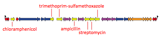
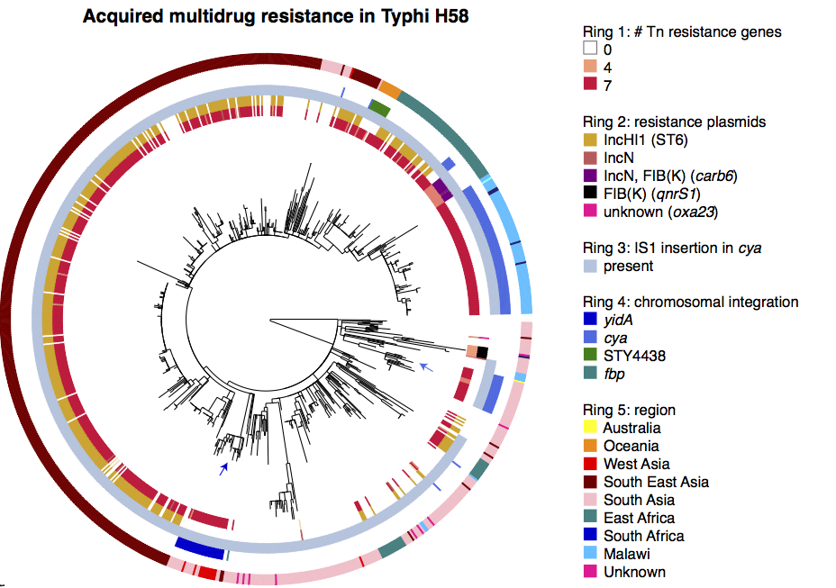
Each can do slightly different things. The biggest difference is that the R script is restricted to rectangular trees and works best for plotting associated data as text columns and heatmaps, like this example (taken from Holt et al, PNAS 2013) of a tree of Vietnamese Shigella sonnei, with tips coloured by city of isolation, and heatmap indicating the presence (black) or absence (white) of accessory genes. Example data files (newick tree + accessory gene content matrix) is available in the github repository).

pan

A version of the R script is now included in the SRST2 repository, which can accept MLST and gene content information output by SRST2, calculate a tree from the MLST data, and plot gene content against this tree, either on an individual isolate basis or summarising gene frequencies by ST. Instructions and example data are here: https://github.com/katholt/srst2#plotting-output-in-r, including how to recreate this figure from the SRST2 paper:

The Python script is best for plotting trees in circular format with simpler, discrete categorical data, e.g. with coloured rings, or colouring branches or clades backgrounds according to tip values; it can also show branch support.

Here are some examples of the script in action, first from our Klebsiella pneumoniae paper (Holt et al, PNAS 2015)…

Screen Shot 2015-12-15 at 4.43.05 pm


…and this example displaying MLST + serotyping data inferred from GenomeTrackr E. coli isolates, done by Danielle Ingle for her paper on serotyping of E. coli with SRST2 (manuscript in BioRxiv, serotyping instructions in SRST2 readme):

Screen Shot 2015-12-15 at 4.47.34 pm


Viewing and manipulating trees (limited colouring of tree branches, tips and names only, no additional data display)

Dendroscope – http://dendroscope.org/

Dendroscope is generally my go-to for visualising, exploring and manipulating trees, although I will rarely use it to generate publication-quality figures. It has a wide range of display options (rectangular, circular, diagonal, unrooted) and allows you to very easily do things like root the tree (midpoint or on a specific branch), extract, collapse or rotate subtrees, etc. It handles input/output in a range of formats (e.g. newick, nexus) and can export images to any format (PDF, PNG, etc). Zooming of rectangular trees can be done in horizontal and vertical axes separately… this is not possible in a lot of viewers (including FigTree), but can be really important if you have big trees with lots of tips.

Tips, branches and labels can be easily coloured and manipulated, and you can save the prettied-up tree in dendroscope format for opening up later. The one thing you can’t do (I think!) is to colour clade backgrounds, which is handy sometimes and is available in FigTree.

One feature I use a lot is ‘Find’ to select tips with a particular property and then use the ‘Format’ menu to colour those tips (e.g. if I have included country in the tip names, I might search for a particular country and then colour all those tips red). The ‘Find’ dialog box has a handy ‘Find from file’ option… e.g. if I have a big tree and want to look at where a particular set of tips are distributed, I can point Dendroscope to a text file of the relevant tip names and it instantly selects those tips so that I can colour them or whatever.

FigTree – http://tree.bio.ed.ac.uk/software/figtree/

FigTree is well known as the go-to viewer for BEAST trees and it is super handy for this as it can display the estimates of height, rate, etc on each branch/node and give you a neat time axis. It is the easiest way I know of to colour clade backgrounds and to show clades collapsed into triangles with meaningful tree depths; and to colour branches by a value in the BEAST output files (e.g. rate, or posterior support). You can also load up a tab-delimited file of variables assigned to tips (column 1 = tip names, other columns = variables), and colour tips by the values of a selected variable (and also colour branches by the value of the child nodes)… although this feature seems to just not work sometimes and I can’t figure out why.

The usual views (rectangular, circular, unrooted) and manipulations (root, rotate, collapse) are available and images can be saved easily as PDF, PNG, SVG, JPG etc. However the viewer is really designed to fit the whole tree in the display window and zooming is a bit of a pain as both horizontal and vertical axes zoom together which is not always desirable (Dendroscope does better at this as explained above).

Annotating trees with data: Web-based viewers

MicroReact – http://microreact.org

MicroReact is an interactive viewer for looking at trees in the context of geography (via a map) and time (via a timeline). It can also display additional metadata via colouring tree tips and map points by the value of a single variable (you can load as many variables as you like but as they are displayed by colouring tips, you can only colour by one variable at a time).

Inputs are a tree file (newick) plus data file (CSV table), and the result is an interactive viewer with a stable URL that you can share with others (and even include in papers) in order to allow them to explore your data.

  • Tree views include radial (unrooted), rectangular, circular, diagonal.
  • Tree manipulations include collapsing subtrees, extracting subtrees and rotating branches.
  • Tree images can be saved as PNG (with transparent background)

Interactive tree of life (iTOL) – http://itol.embl.de/

iTOL is an interactive viewer for displaying trees along with a wide range of different annotations and data types, including binary indicators, bar charts, pie charts (including on internal nodes), colour gradients, heatmaps, boxplots, animated time series, protein domain architectures and connections between nodes. It is interactive in the sense that once the data is loaded you can manipulate the tree view, and projects can be saved and shared to allow others to explore the data, however unlike MicroReact it is really most useful for creating static images.

  • Trees can be viewed as radial (unrooted), rectangular or circular.
  • Tree manipulations include collapsing subtrees, re-rooting, pruning and rotating branches.
  • Tree images can be saved in a range of formats including PNG, SVG, PDF, etc.

ScripTreehttp://lamarck.lirmm.fr/scriptree/

This is a web-based scripting system for creating static images of trees annotated in various ways, including with bar charts of data.

Locating drug resistance regions in short reads, using Bandage and ISMapper

In our recent paper on Salmonella Typhi, we described the multidrug resistant (MDR) clone H58 that is sweeping the world.

We’ve been monitoring this clone for almost 10 years (and the data suggests it actually emerged in the early 1990s), but the big change noted recently is the movement of the drug resistance locus out of the large conjugative (IncHI1) plasmid and into the chromosome.

I think this is critically important, because it means the large plasmid that carried the multidrug resistance genes into the cell can be lost, relieving the bacteria of the burden associated with replicating and expressing the plasmid genome, without losing multidrug resistance.

However, figuring out the location of the MDR locus is tricky, because it is flanked by copies of the IS1 transposase. This is what it looks like (the red genes on the ends are the IS1 copies).

Multidrug resistance locus in Salmonella Typhi

Multidrug resistance locus in Salmonella Typhi

Repeated sequences like these flanking IS1 sequences complicate assemblies… because there are multiple possible paths in and out of the repeated sequence, most assemblers will place the repeated sequence in its own contig, and the various paths in and out of it in separate contigs.

Here’s an example of an assembly graph showing the MDR locus above, visualised using Bandage, developed by Ryan Wick in my group… The green bit is a BLAST hit to the whole IS1 transposase, and you can see there are multiple alternative paths through the IS:

bandage IS1

And here is the same graph, but this time colouring in all the genes encoded within the MDR locus (BLAST hits to each open reading frame are shown in a different colour; the IS1 has 2 ORFs):

Screen Shot 2015-07-20 at 3.33.59 pm

So, inferring the location of the MDR locus from short read data is important but tricky. What do do?

Well, turns out it’s pretty easy to figure out what’s happening using Bandage! In this example, we can’t tell where the IS1 (and MDR locus) is inserted by looking at the assembled contigs. But by looking at this graph, we can see there are only two paths out of the IS1; one leads into the MDR locus (and back to the IS1), and the other leads to a single contig. By exporting that contig sequence from Bandage and blasting it in NCBI, it’s pretty trivial to discover that this is a piece of Typhi chromosome!

Here’s an example assembly graph from a different strain:
Screen Shot 2015-07-20 at 3.45.54 pmWhen I use Bandage to blast for the IncHI1 plasmid sequence (hits in blue) as well as the MDR locus genes, it’s pretty easy to see that the MDR locus is located in the plasmid:

Screen Shot 2015-07-20 at 3.47.05 pm

So basically – Bandage can be super useful for locating resistance genes (or any genes of interest really), in the presence of repeat sequences!

In the Typhi paper, we had hundreds of genomes to analyse so of course didn’t manually inspect each graph. Instead we used ISMapper (from my PhD student Jane Hawkey) to determine the IS1 insertion sites in each strain, and coupled this with what we knew about the presence of the plasmid and resistance genes in each strain (using SRST2, also from our group), to figure out which strains had the MDR locus and where:

MDR_summary_regionAsRing

Of course, all this is easy with long read sequencing… in the paper we used PacBio to confirm some the insertion sites in cyaA and yidA, and the guys at Public Health England independently found the yidA site using Nanopore.

But with the right tools, you can actually figure out a lot of these questions using Illumina data alone.

R code to infer tree from ANDI output

Just playing with ANDI, for building whole genome trees rapidly from large sets of genome assemblies
Code: https://github.com/evolbioinf/andi/
Paper: http://bioinformatics.oxfordjournals.org/content/31/8/1169

It seems really great, and lightning fast (few seconds on ~100 genomes).

The output is a phylip distance file, which is not something I normally work with, having spent the last 5+ years inferring trees with ML from DNA alignments and not thinking much about distance based methods!

So I wanted to figure out how to handle this output simply in R.

The answer is easy, code below… the only tricky thing is that there were a couple of genomes in my genome set that returned NaN for pairwise distances with other genomes, which need to be removed before you can infer a tree.

Note there are lots more tree inference options in the ape library, nj is just one example.


# function to remove rows with unknowns 
dropNA <- function(d) {
na <- apply(d,1,function(x){sum(x=="NaN")})
while (max(na)>0) {
na.drop <- c(1:length(na))[na==max(na)]
d <- d[-na.drop,-na.drop]
na <- apply(d,1,function(x){sum(x=="NaN")})
}
d
}

# read distance file output by ANDI
d<-read.table("andi.phy",header=F,skip=1,row.names=1)
colnames(d) <- rownames(d)

# remove rows with unknowns
d <- dropNA(d)

# infer tree from distance
t<-nj(as.dist(d))

# write tree
write.tree(t,file="tree.nwk")